Griffyn HeelsAgile Delivery Manager
How Australian universities can use time-saving Drupal modules to deliver excellent digital experiences with minimal developer involvement.
We work with several leading Australian universities that use Drupal to engage and attract current and prospective students.
These unis experience similar problems:
So, which modules do we recommend our higher education clients use to address these problems?
Layout Builder is our most frequently recommended module for universities.
It provides editorial flexibility and control over complex page designs without ongoing developer involvement. Once configured, content authors have a suite of layouts and components–freeing them from strict templates.
We also recommend giving the out-of-the-box experience a polish. Customising labels and help text makes it easier for newbie Drupal editors and users to maintain complex and exciting landing pages.
It's worth noting that Layout Builder's user experience is constantly improving, thanks to a community of contributors. In an upcoming blog post, we'll share recommendations for the additional modules you should use, plus custom code for an exceptional user experience.
This approach can be rolled out in stages across individual content types even after a site is launched using an alternative editorial system such as Paragraphs.
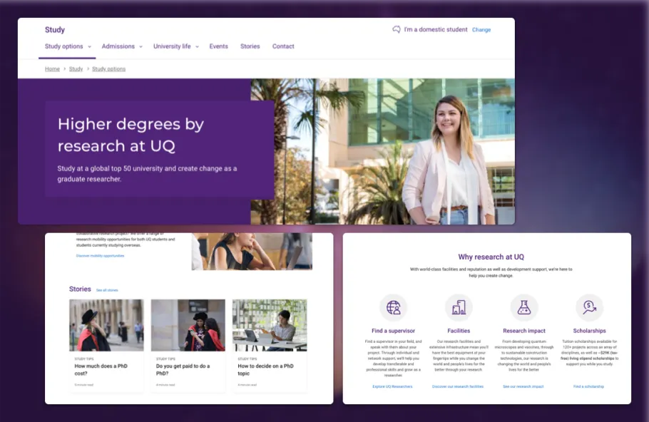
University of Queensland's Future Students content hub

We developed reusable components for the University of Queensland (UQ) content and marketing teams. These ready-to-go pieces included the hero with several editable elements, tiles that link to other content, and an icon grid with prebuilt icons for consistency.
Each component can be reordered and edited in real-time with a preview. The good news is that content editors can also chop and change these parts with minimal Drupal CMS experience.
For a more targeted experience, users can change seamlessly between domestic and international content based on their student type.
The Entity Hierarchy module makes it easier for editors to use and organise content, creating more straightforward navigation for users.
It's not unusual for universities to own over 20,000 individual pieces of content or 'nodes', including pages, blog posts, course listings and event pages. How that content is stored and retrieved is critical to the site's overall performance, and that's where Entity Hierarchy plays a vital role.
University site IA is typically modelled in a content hierarchy and presented to the user with components like a sidebar menu. The Content Hierarchy module is designed to retrieve current page positions and its ancestor, descendant and sibling pages in the most performant fashion using a ‘nested set’ data model.
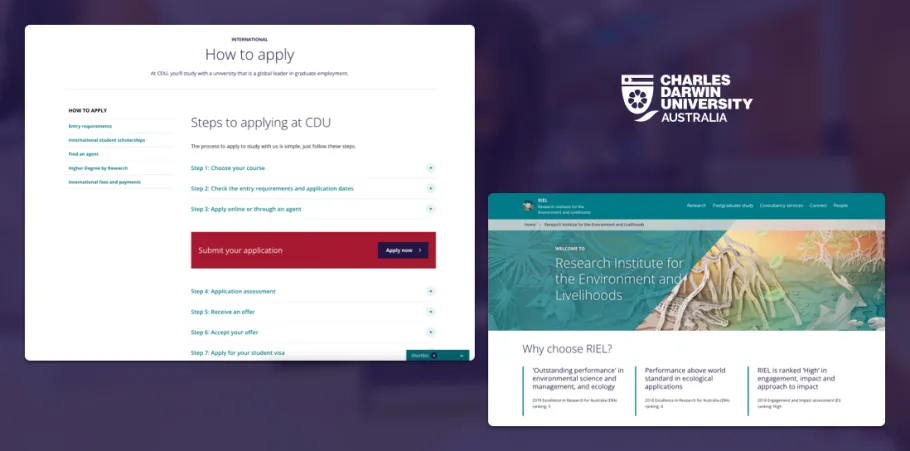
Charles Darwin University's Research Institute for the Environment and Livelihoods

Charles Darwin University (CDU) supported the extension of Entity Hierarchy's functionality further to create microsites within their CMS.
The microsite sub-module designates one page as the 'microsite homepage'. This homepage can have a secondary navigation bar, unique logo and title elements. Each microsite then inherits all the styling and existing CMS functionality without the overheads of maintaining a separate Drupal site.
As a result, maintaining and monitoring a suite of Drupal properties becomes much more manageable for smaller teams.
The Backfill Formatter module automatically suggests recommended content to users based on its similarity to other content.
This automation saves content editors time and ensures there's always a next step laid out for users in their content journey.
Each instance of the formatter can be configured to nominate which vocabularies should be used to determine the most related content. For example, when placing a list of 'related programs or courses', it might be appropriate to match the study area and level (e.g. undergraduate or postgraduate).
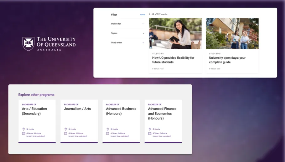
University of Queensland's Bachelor of Business Management - Explore other programs

The University of Queensland (UQ) uses Backfill Formatter to suggest related content such as similar courses and associated news articles in their course information.
UQ content admins can control these recommendations either fully or partially, with the CMS populating the remaining available space.
In the quest for more extraordinary user experiences, our clients need straightforward solutions that overcome barriers to managing their typically large and numerous websites.
Layout Builder, Entity Hierarchy and Backfill Formatter have all proven to be successful in supporting higher education institutions to keep delivering excellence online and in the lecture hall.
And whilst we enjoy spending time with our clients, we also make it possible for them to maintain their sites with less developer involvement!
This blog post is based on a showcase I gave at DrupalSouth 2021, you can see a recording of that here: https://youtu.be/z5gbLfHqPx4