Easy improvements for Drupal content editors using contrib
Get started with some quick and easy ways to improve the content editor experience, using contributed modules.
As a former content editor, and current Drupal project manager, I'm on somewhat of a crusade to improve the lives of my former colleagues.
And not just because it's a nice thing to do. When the CMS is nice to use, the editors will use it more. When they can do things faster, the can do more things.
There are lots of content management systems that are really inflexible and difficult to customise. Drupal is not one of them. So there is simply no excuse for delivering a Drupal site with a crappy editor experience!
I've got a lot to say on this topic - and you can get the full experience here - but I'll start with a few contributed modules that can help simply by installing them.
1. Administration views (with Views bulk operations)
The Drupal core administration pages for content and users lack some really basic features that content editors need. You can just assume that a keyword search for content is required, even if it hasn't been specifically requested. And no, 'Just use the site search' is not an acceptable alternative.
The Administration views module solves this problem by replacing the core pages with views. Not only does it provide better exposed filters by default, it also allows to you to further customise the page as needed, just as you could any other view.
Here's what the admin/content page looks like with Administration views enabled:

As a bonus, it requires the views bulk operations module, which enables easy bulk updating of content. You can select any number of nodes and then choose from the operations list, including 'Change value'. So with a few clicks, you can update hundreds of nodes.
Drupal 8 update: With views in core for D8, these pages are views by default - no extra modules needed! But that doesn't mean the job is done. You can always improve the view with additional filters.
2. Administration menu
Sometimes it takes five or six clicks to get where you need to go in the admin pages. Administration menu converts the regular toolbar into a drop-down menu, saving time on nearly every action. If you perform that action several times a day, that can measurably increase efficiency.
In this (extreme) example, admin menu turns six clicks into one:

And it's not just saving clicks to get where you want to go. One of my favourite things about this feature is that it saves you clicking on the wrong thing, too. If you can't remember where a page is located, you can flip through the drop-downs to find it before you click.
3. WYSIWYG
There is just no getting around this one. So instead of fighting it, come up with some sensible defaults and save having to set one up from scratch each time. Talk to the editors about what they need to ensure you're including it.
Drupal 8 update: CKEditor is in D8 core, so if you're using a different one, it may be time to switch!
4. Linkit
Embedding internal links can be very time consuming, but Linkit solves this problem. Without Linkit, if you want to link to internal content, you have to find the content (not always easy), copy the node ID or path alias, and create a regular hyperlink.
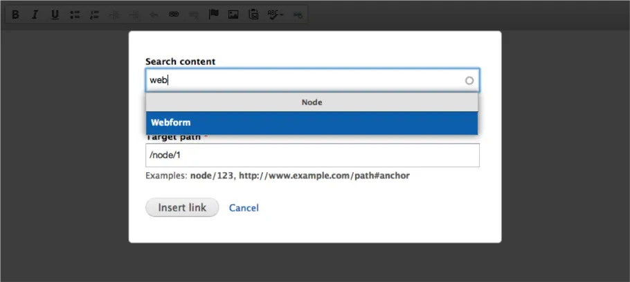
Linkit provides a WYSIWYG button for creating internal links, where you can search for content by title. When you click the item from the autocomplete list, it creates a path based on the node ID. You can create different profiles for different levels of access, based on role. Linkit supports linking to nodes, files, taxonomy terms and users.
Here's what you get when you click the Linkit icon:

By default, Linkit does not allow linking to file paths, but instead links to the file entity. In most cases, that doesn't work for our clients, but luckily the problem is solved by this patch on drupal.org.
5. Login destination
One of my clients asked, 'Why do I go to this weird profile page when I log in?' I had never thought about it - because that's just what Drupal does - but on most of the sites we build, the user profile page is not relevant. So we're presenting users with a totally useless page every time they log in, which for some users is every day (sessions expire daily for security reasons).
Login destination allows you to configure the redirect on login, even allowing rules per role. So content editors can go to the content admin page, or their workbench, or some other page. Ask them what their preference is! Some roles have limited access and perform only one or two actions. Choose a page that is useful and save them having to find it each time they log in.
Here's a rule for all roles, to be redirected to admin/content:

6. Shiny admin theme
Admittedly not a critical issue, but there are some nice alternatives to the Seven administration theme. I like Shiny, which is the admin theme from Commerce Kickstart, and also provided some of the basis for the Drupal 8 admin styles. Ember, the theme from the Spark distro, is also a great option, since the release of the 2.x branch.
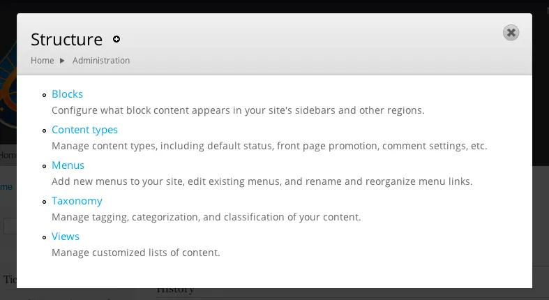
If you happen to use the overlay, Shiny makes even more of a difference:

The admin theme might seem insignificant, but for people who spend their entire day among the admin pages, even small improvements can make a big difference. Try them out and see which you prefer - or find a better one!
Do you have other contributed modules that your content editors can't live without? Please share them in the comments!