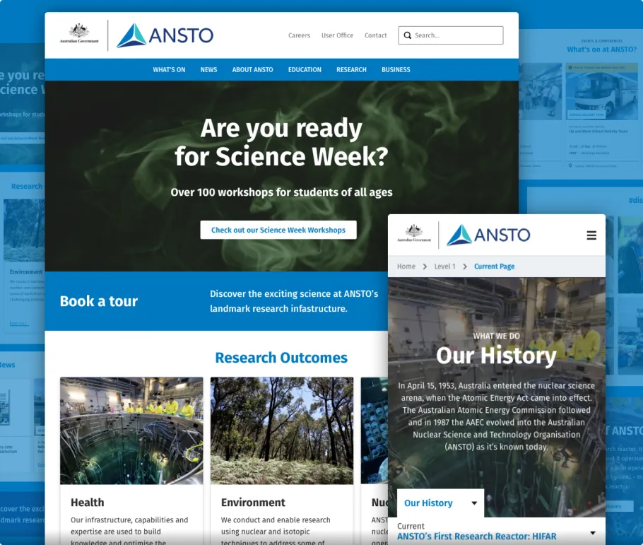
ANSTO is one of Australia’s largest public research organisations working to find solutions to some of the biggest questions in science. To coincide with their brand relaunch in 2018, PreviousNext was engaged to design and deliver their new website built on Drupal 8.

Discovery. What did we find?
In our initial research phase we found the legacy ANSTO website suffered from a classic case of being added to over time, resulting in a lot of design variations and a fragmented visitor experience. Upon closer inspection, many sections of the website were providing duplicated information — we had to fix this.
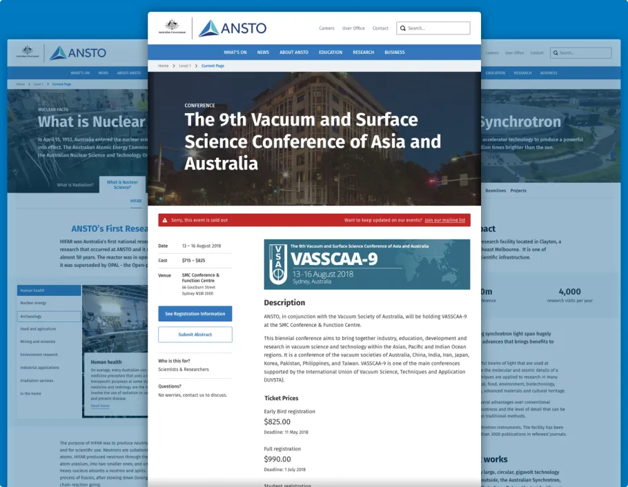
Though variations aren't inherently bad, there needs to be a reason behind them to make sense to users. As is the case with many websites, there are often scenarios that deserve a richer experience than the generic building blocks. Putting a design system in place ensures a solid and consistent foundation to add to over time.

Design System: A component-based approach
For projects like this we often recommend a design system to help consolidate the experience. Design systems are like a collection of "building blocks" that make up your website.
Starting with the foundation
A design system establishes order and consistency throughout a project and, at its most basic, can be made up of a UI kit; a style guide that ensures the basic building blocks such as buttons, colours, fonts, text fields and spacing are consistent throughout the website.
Design patterns: Consolidating the user experience
The benefits of a design system go beyond consolidating the visual design too, it establishes the rules for how the user experiences the site as a whole. In ANSTO's case, our design system contained the templates and components necessary to cater for all basic content needs. A core principle was that every piece of content that wasn't deemed "high priority" would conform to this basic template to establish consistency in design and user flow.
Catering for Richer Experiences

As with most websites, there are often aspects that need to be given an experience more appropriate to the subject matter. In ANSTO's case, there was content that would be too restricted if we used only the basic templates — the information was just too important, the content was too dense and we needed to take full advantage of assets such as images and video.
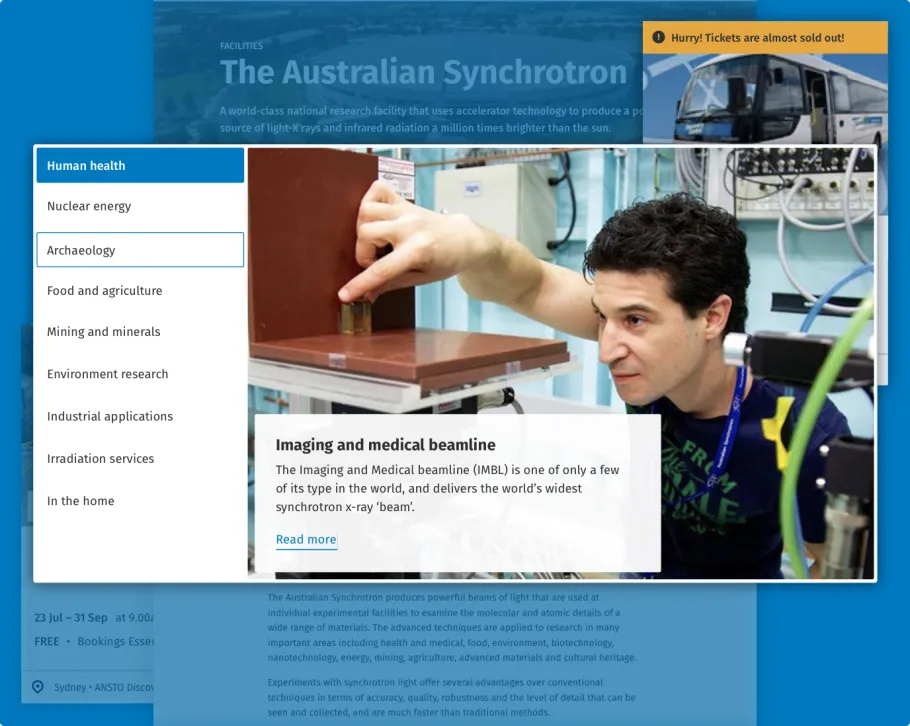
Tabbed Component: Providing a visual and interactive way to see content at a glance

This component was designed to allow visitors to engage with a collection in a more interactive way. The section-listing gave a snapshot of what the collection contained, while the short preview provided a quick summary of what the topic was about with a link to the extended description. It was a much more effective and efficient method of presenting the content than an endlessly scrolling page.
Putting a design system in place for the ANSTO website provided clarity over what the website was made up of and also ensured consistency across the entire experience. While a design system looks like it's just an organised catalogue of the design elements, its true value is in what it represents for the team; a collaborative artefact of everyone's shared understanding.
Visit ANSTO