The Agency (ADHA) wanted to reposition itself to better support the needs of all Australians. We were approached to engage target users of the website in order to test and validate assumptions and provide recommendations for a new website. The outcome would more fully represent ADHA's vision, direction and Digital Strategy.
Digital health today
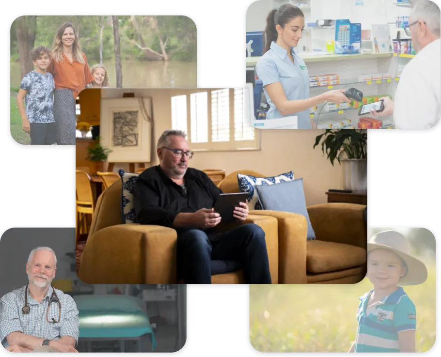
As technology advances and continues to shape our lives, the topic of “digital health” becomes more and more relevant to the everyday Australian — especially recently during COVID.
The Australian Digital Health Agency (ADHA) is the Government Agency responsible for providing Australians with access to the growing number of digital health services available, including Telehealth, Electronic Prescriptions, My Health Record and more.
Getting the team aligned
Workshops are an effective tool for making big decisions, getting everyone on the same page and most importantly, finding somewhere to start. Understanding the project history, and how context and existing research impacts the goals and vision of the current project can often be the most paralysing part of the process.
A well-structured workshop helps the team navigate through these challenges by working together to identify what is important or relevant and where to focus energies.
Two of our most common workshops during discovery are the Purpose and Direction Workshop and the Design Studio.
Workshops
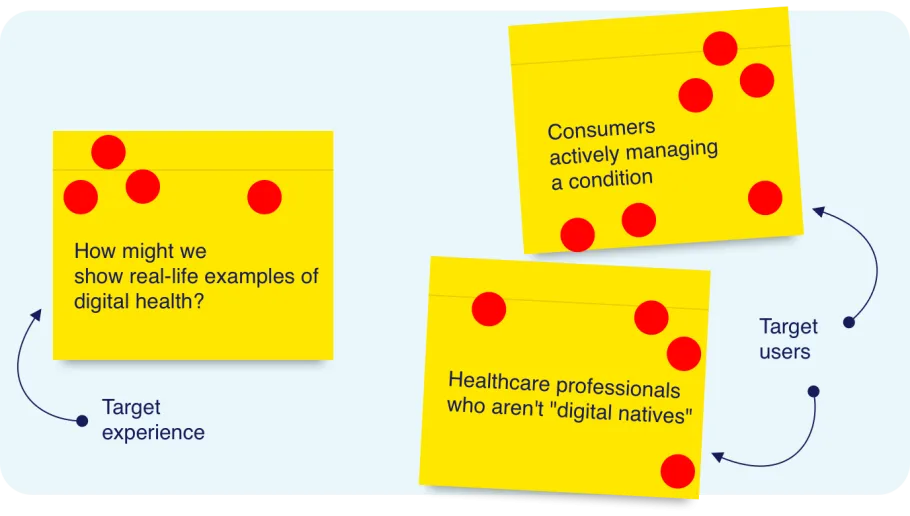
Workshop: Purpose and Direction:
The intent of this workshop is to align on two main areas; the target experience and the target customer (or customers in our case). It's a valuable exercise when starting a project as it helps us engage with key stakeholders and gain a deeper understanding of the project’s history and the broader vision.
The workshop also helped us navigate what was relevant from the existing research. The Agency provided us with several user research reports which helped inform a comprehensive understanding of the problem space. We then collaboratively decided what would help move the project forward.
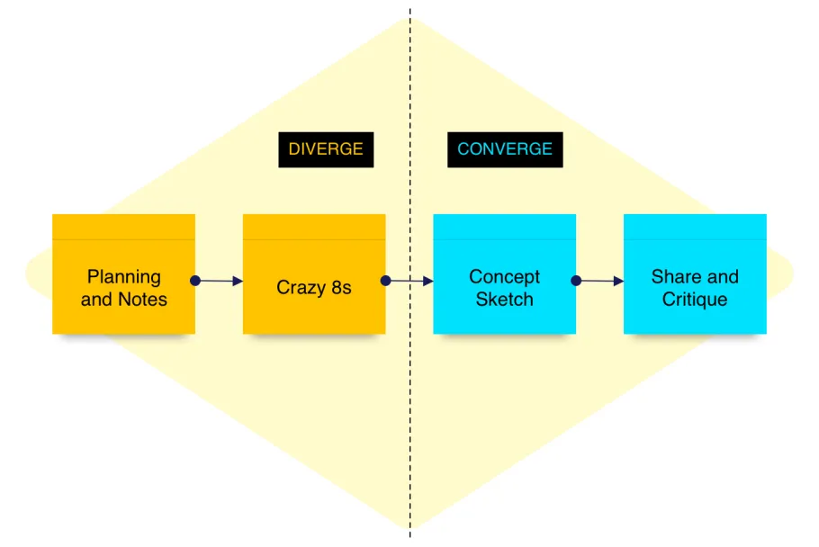
Workshop: Design Studio
With the target experience and customers defined, the purpose of this workshop was to generate ideas for how this experience could be reimagined.
The workshop is made up of several activities across two phases; Diverge and Converge.
- The first phase, Diverge, is all about idea generation. The rapid-sketch exercises help everyone get as many ideas out as possible without getting too attached too early.
- The second phase, Converge, shifts the focus towards narrowing down ideas. The team participates in a series of activities where they both critique ideas and build on top of them. This fosters a collaborative environment where everyone feels included, invested and equal.
While the goal of these workshops is to inform the direction of user testing, we find the biggest benefits lie in how they help strengthen the team early on. They help to build trust and peace of mind (which is especially valuable in relation to key stakeholders who are not part of the day-to-day).
Testing our assumptions
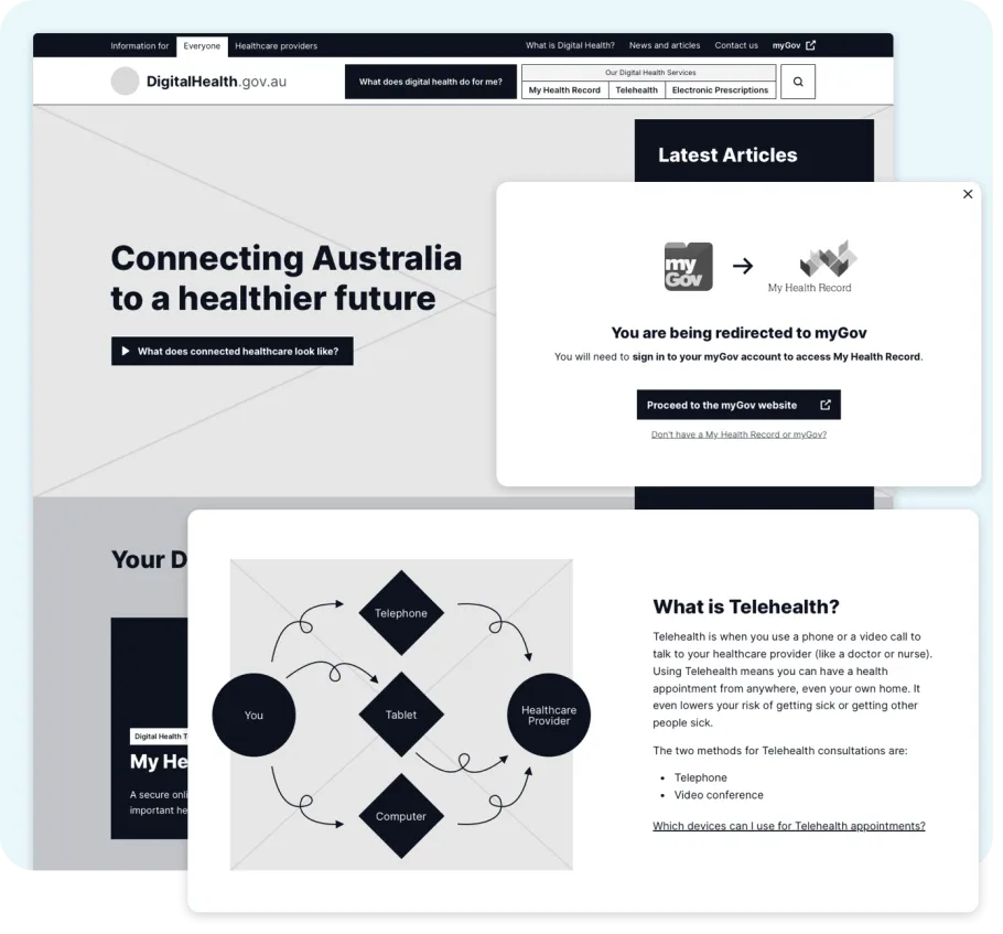
A website about Digital Health
We assumed that finding and understanding Digital Health services was important for all Australians. Building a better web experience would increase awareness and knowledge of the digital health services and help Australians make more informed choices about their healthcare.
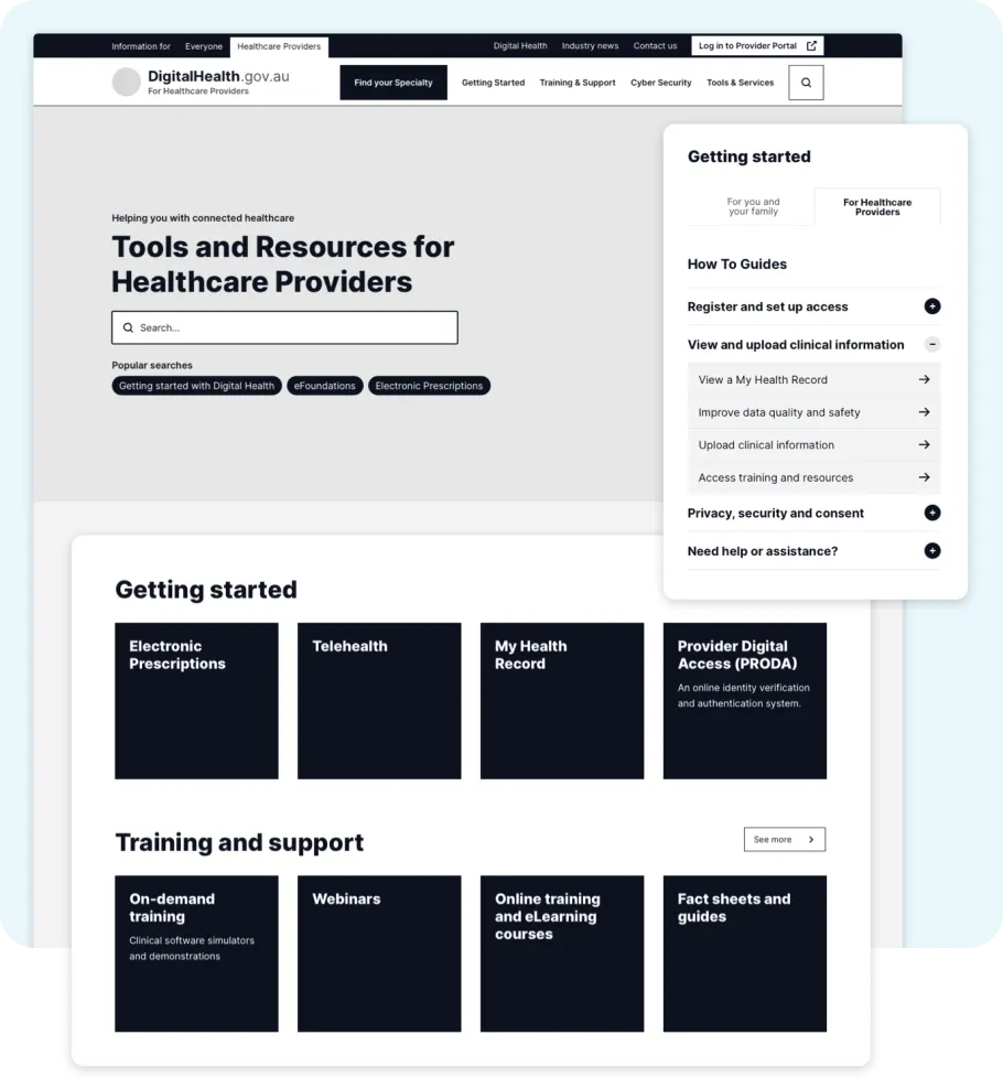
Dedicated space for Healthcare Providers
We assumed that providing a dedicated space for Healthcare Providers would be important for industry professionals. This website would serve as a hub for healthcare professionals. It would be somewhere they could easily find specific content that relates to their industry and digital health services (without cluttering the consumer-facing website).
Outcomes and takeaways
As this was our first PDP (Project-During-a-Pandemic), our processes were really put to the test. All of our in-person activities needed to be revised and adapted to work remotely (which was particularly challenging for the usability tests).
Running (not-so) in-person usability tests
Running usability tests in 2020 means you're probably doing them remotely. For us this meant a change-up in our tooling and templates. We used a combination of Zoom, InVision and Notion to help run the sessions. And while Notion took a lot of initial setup, we're not going back to clipboards and paper!
Interested in learning more about Rich's Notion setup?
Validating our assumptions
While each of the sessions uncovered a lot of interesting insights (especially with words, content and terminology), what we found most validating was that the participants acknowledged the value and utility of the Digital Health website as a "one-stop-shop" for information regarding the digital health services.
Similarly, the healthcare provider participants also expressed that a dedicated Healthcare Provider website would be a valuable resource for industry professionals. Keeping industry-specific content in a separate website sets expectations around what to expect and would make the content easier to find.
An opportunity to improve our processes
As a distributed company, we're already well accustomed to working from home. But for many of our clients (and let’s face it, most people), this was a new experience which we all had to embrace and adapt to. We saw this as an opportunity to tighten up our process and be more intentional about each activity, milestone and meeting. The result was that everyone on the team had greater visibility on the overall process and the significance of each step. This transparency gave the client more confidence and peace of mind as they were also able to help shape the project's direction knowing how each activity impacted the next.
Visit the Australian Digital Health Agency website