Consistent user experience
The State Library of South Australia is the state's largest public reference library, with a collection focused on South Australian information and general reference material for information and research purposes. The library engaged us to research their customers' needs and design a new modern, engaging and accessible website in Drupal 8.
- Client
- State Library of South Australia
- Industry
- Government
- Service types
- Content and UX

Context
Typically a website's navigation should be structured around promoting the most important services based on what your visitors are there to see. At a quick glance, you should understand what you can expect to find and which sections are most important.
This was the main concern we had with the website. Yes, the visual design needed a refresh and needed to cater to a modern audience, but it was the navigation and information architecture where we saw the most opportunity for improvement. A key focus for our Discovery Phase was understanding what the Library internally valued, whilst understanding what public visitors came to the Library to actually do.

Focusing on what's important
Design Review
Typically a website's navigation should be structured around promoting the most important services based on what your visitors are there to see. At a quick glance, you should be able to understand what you can expect to find and which sections are most important.
This was the main concern we had with the website. Yes, the visual design needed a refresh and needed to cater to a modern audience, but it was the navigation and information architecture where we saw the most opportunity for improvement. A key focus for our Discovery Phase was understanding what the Library internally valued, whilst understanding what public visitors came to the Library to actually do.
Optimising for the Top Tasks
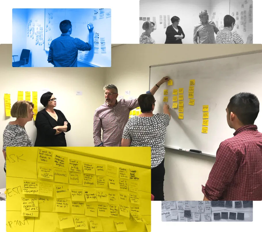
Discovery: Workshops, alignment and discussion
While there's a lot to do and see at the State Library of South Australia, a key takeaway from the discovery workshop was that visitors were typically interested in:
- Events, exhibitions or tours
- Learning programs and workshops
- Seeing the collections in person
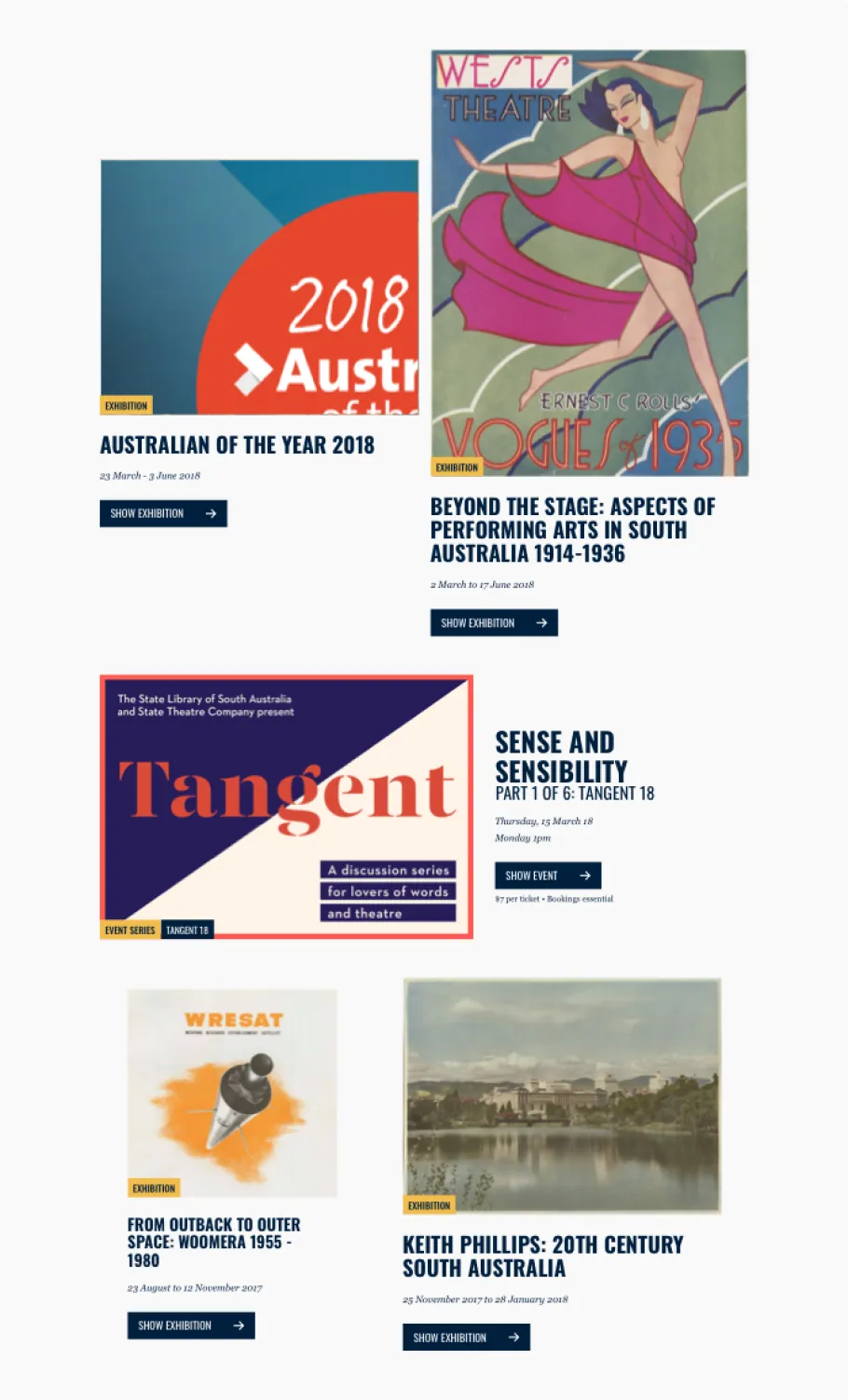
This was an interesting insight as while the workshop participants agreed that these were the Library's core attractions, they weren't apparent in the existing website navigation. Another interesting takeaway was that while customers see events, exhibitions and tours as similar things, they were only treated separately throughout the website because of the departments responsible for facilitating them.
What was clear was that in order to optimise for these top tasks and be in line with our visitors’ expectations, we had to reorganise and simplify not only the navigation, but also some of the content.
Making the most of the opportunity
Advocating for a cleaner, more conventional navigation was critical in helping visitors find the right content, but once they were there, we had to make sure we were delivering what they expected to find.
Designing a flexible and dynamic template
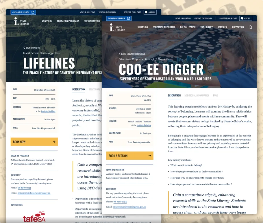
Beyond grouping content types together, when we analysed them, we found that there was a lot of overlap not only between events, exhibitions and tours but also learning programs and workshops. For example, they all had descriptions, dates and times, special requirements, a primary call-to-action (like making a booking) and often imagery or videos to help generate interest and provide more context.

As a result, we were able to focus on a more dynamic design that catered to a broader set of requirements. While it front-loaded some extra design and discovery effort, it saved a lot on development effort and helped content authors by providing consistency. As this was identified early, we were able to make each experience feel different in its own right for website visitors.
The Collections
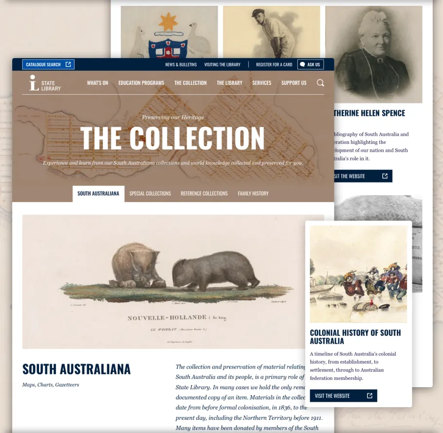
Seeing the collections was a big part of the library experience. With a focus on 'South Australiana', the Library's Collection is huge, ranging from photographs of the World Wars, journals, posters, films, newspapers, transcripts and even oral histories.
In the legacy website, if you knew what you were looking for, the items are catalogued in both the Library's online catalogue and the Digital Collections platform, an online showcase of selected items from the Library's collection.
The biggest opportunity that was identified was awareness; people just didn't know what they could look for.

The goal wasn't for the website to showcase everything. Instead, its purpose was to help provide a context for the collections and give visitors a starting point to explore the collection in person (or to browse the digital collection).

While the legacy website did have a lot of content that visitors found helpful, it wasn't organised or presented in a way visitors expected to find it. This presented the most compelling opportunity for the team to rally around because, while it was important for us to ensure the look and feel were modernised, it was more critical that we established a clear and consistent user experience.