Design system integration and sidebar menu
Implementing sidebar navigation required changes to the component-based grid system for this university client, making it easier to apply changes to the layout. This process also prompted a review of their design system, which had been built separately but not integrated into the site.
- Client
- Anonymous
- Industry
- Education

Highlights
- Introduced Design System components
- Established new grid systems
- Added local navigation
- Refactored key Layout Builder components for Design System compatibility
Deliverables
- Design System integrated into the website
- Sidebar navigation
- Component-based layout
The Solutions
Component-based grid system
We moved the client to page-level components that implement CSS grids, giving them responsive page gutters that match the existing site containers and a responsive, custom-designed grid within the page gutters.
This differed from their existing, traditional 12-column grid system, which required developers to hand-craft layouts using CSS classes that corresponded to each column width. This approach required markup changes to alter the grid layouts down the track. It also meant developers needed deep knowledge and clear documentation so they could implement layouts from designs.
The benefits of a component-based layout are that it can coexist with the existing grid system, devs can easily replicate consistent page layouts, modifications are done at the CSS level, and it’s easy to expand and build upon.
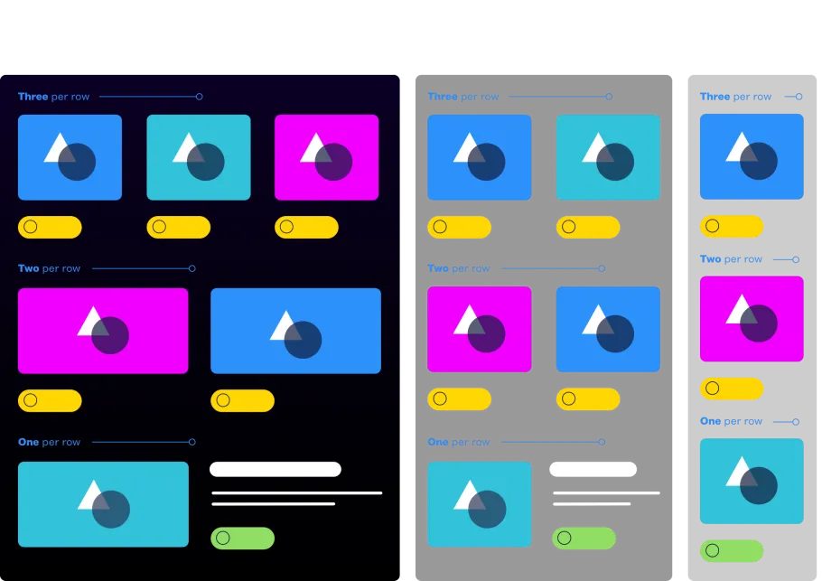
Card grid
The card grid component was added to allow cards to display in different combinations depending on the width of the container, using container queries. These cards have options for configuring them, depending on how editors would like them to display.
The ideal number of cards per row is three, two, or one. At smaller screen sizes, the number of cards per row dynamically adapts so the content isn’t squished.
The previous card grid system was based on the 12-column grid, requiring markup that implemented CSS classes from the grid system. Because it was a page-level component, it could not be altered without changing the overall grid.
We took this approach because the previous card grid couldn’t be converted to the new local nav layout without markup changes or CSS overrides—both of which introduced technical debt. It also didn’t work across full-width pages, such as the homepage.
Container queries, on the other hand, allowed us to alter appearance without introducing CSS class-based overrides. This meant it worked on full-width pages and pages with the local nav, developers could implement it consistently using greatly simplified markup and CSS, and the client was no longer tied to the 12-column grid system.
Achieving a local nav layout
With a component-based approach, page elements are placed using child components, which have a set column width and position in the overall page layout.
There’s no limit to how many child components we can implement here and how they fit into the overall page layout.
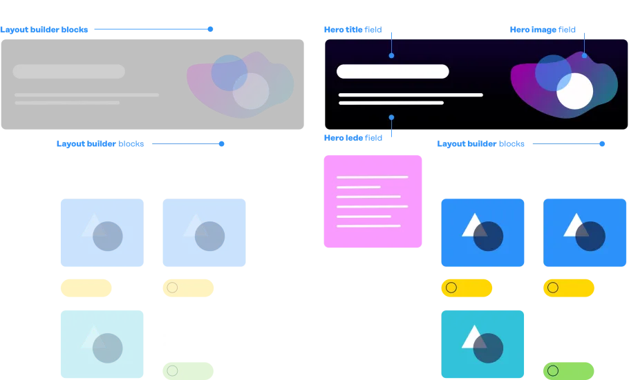
Hero block migration
In order to integrate the local nav layout into page templates featuring a hero banner, the hero component was migrated out of layout builder, and a hero title field, image field and lede field on the node were automatically populated with data from the layout builder hero block.
Decoupling the Design System from the Style Guide
The aim here was to designate the Design System as the single source of truth, with the Style Guide becoming legacy.
The previous approach had created multiple sources of truth, as the design system had been built separately but not integrated into the website.
Instead of implementing design system assets in the Drupal theme layer, a companion module was used to separate concerns, including CSS and JS as Drupal libraries, Layout builder Twig templates with companion PHP classes, and component Twig templates implemented as PHP classes using the Pinto module.
By following this approach, the Design System became technology and framework-agnostic, while the Drupal Style Guide was gradually deprecated. This transition was aided by conventional commits to manage the release process, a component checklist in Storybook to articulate the status of each component, and deprecation notices in the Style Guide to show when a component shouldn’t be used.
Sidebar nav
The sidebar navigation uses the Menu Link and Menu Breadcrumb modules. Links become content and can be managed in the same way that Drupal manages content. Revisioning control allows menu items to be added and then approved before publishing. It was built in React, which was added as a dependency in their codebase for use in further projects.

The Results
Design Systems are ideal when they’re structured for longevity, consistency and editorial ease. In this case, we were able to also help the client simplify their use of components and ensure the right level of flexibility. They can now build anything new in a consistent and extendable structure.
The addition of static sidebar navigation provides a highly customisable and hierarchical way of organising information that is easy for users to scan and for the client team to manage.